← All casesBrand identity
Katse Desarrollos
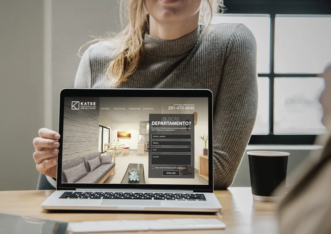
Brand identity and website for Katse, a young real estate developer.
The challenge
Katse is a young developer with high growth expectations for its projects. It needed a brand to support that growth.
The solution
We created a complete identity system, from the symbol to stationery, and carried it through to the website.
01 / 05
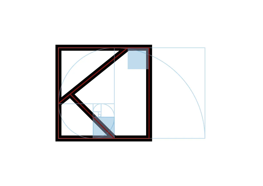
Building the symbol
The K is built on a grid of precise proportions.
02 / 05
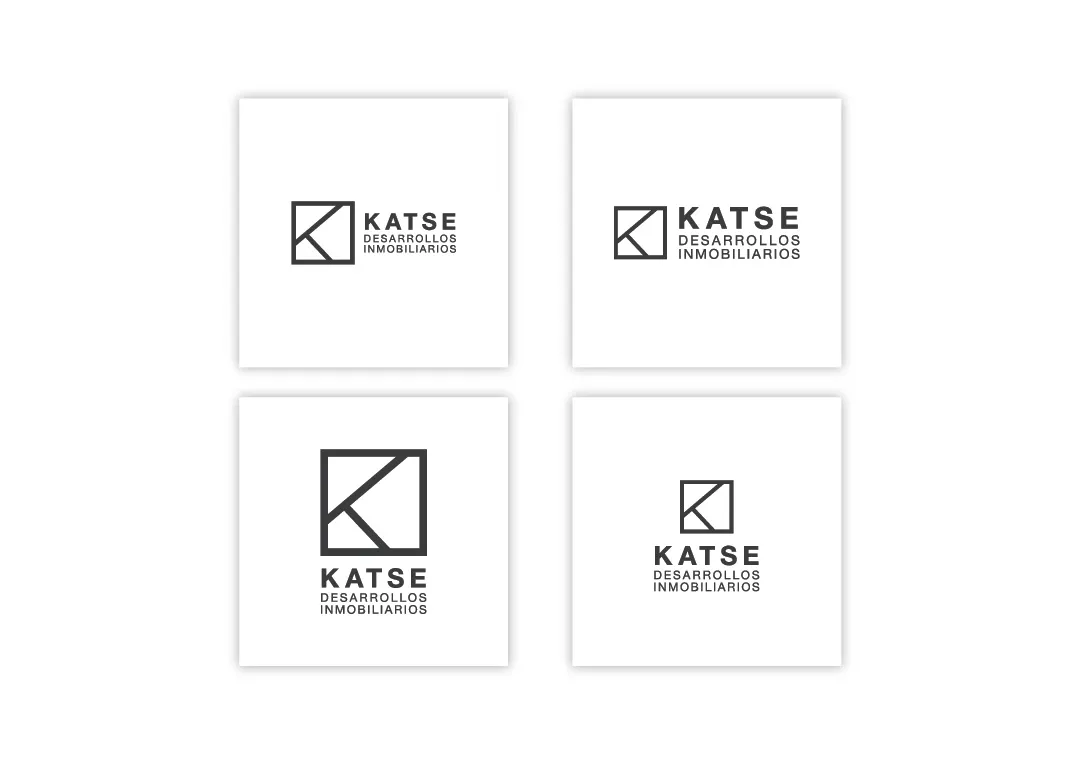
Brand versions
Horizontal, vertical and compact variants for every use, in light and dark.
03 / 05
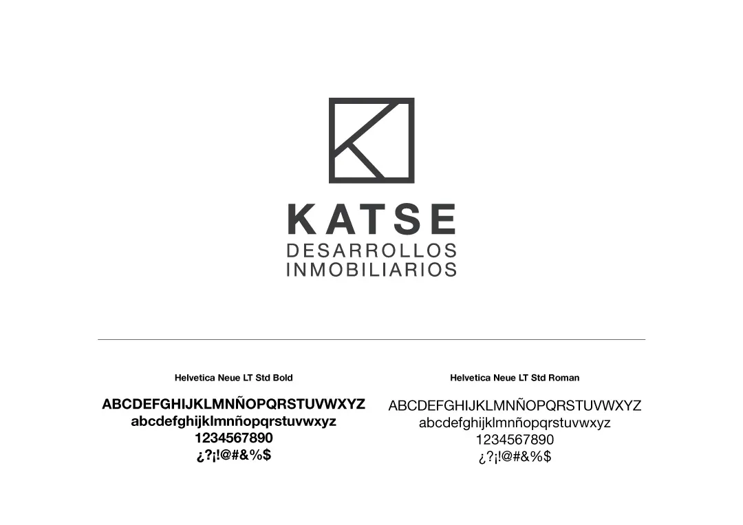
Typography
A restrained type family accompanies the symbol.
04 / 05
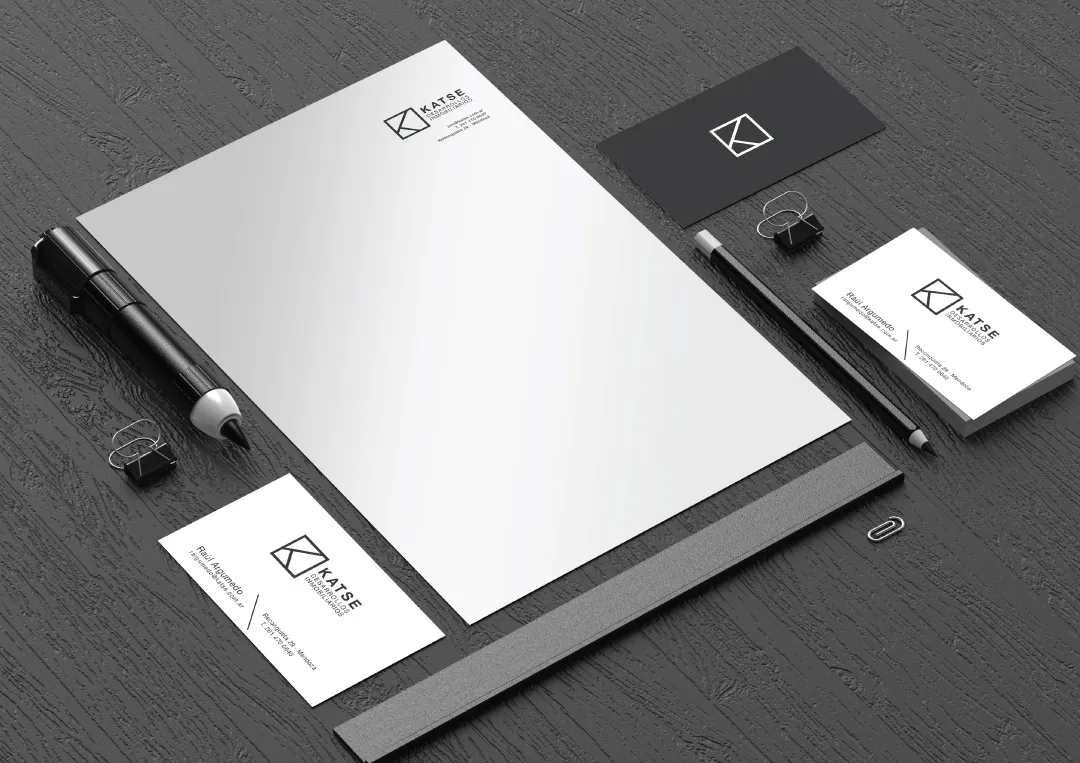
Stationery
The identity applied to letterhead, envelopes and cards.
05 / 05
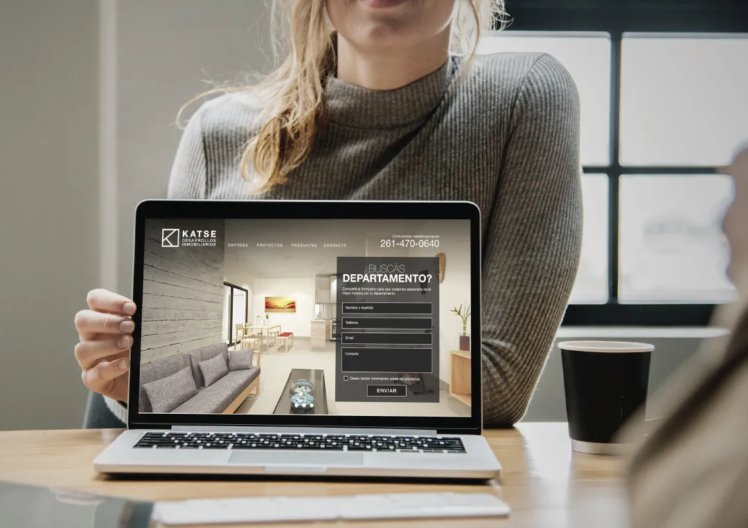
Website
The brand carries over to the developer's website.